Huddle Up: A Social Scheduling Case Study
Case Study by Asia Yin
A social calendar-sharing app that connects the ease of professional scheduling tools with the spontaneity of informal event planning. Designed specifically for social settings, it offers a clear view of shared schedules, making coordination effortless. By prioritizing user-friendly features for social interactions, Huddle Up eliminates the hassle of switching between multiple apps, streamlining the entire planning experience.
Role
UX/UI Designer
Tools
Figma/Canva
Overview
Why Scheduling?
As I’ve gotten older, it’s become increasingly challenging to spend time with friends. Everyone is juggling busy lives, balancing demanding schedules—some with 9-to-5 jobs, others in the service industry with completely opposite hours. I wanted to explore this issue further to see if there was a way to simplify the process and make connecting with loved ones easier.
The Problem
Planning social events involves both scheduling and communication, but existing tools fall short:
Professional tools like Google Calendar and iCal are excellent for work but lack features tailored for personal use.
Messaging apps such as iMessage are widely used but have no scheduling functionality, often resulting in missed or overlooked details.
Specialized apps like Plexis attempt to address social scheduling but face usability and adoption issues.
This leaves a significant gap for an integrated, user-friendly platform designed for social event planning.
Research
Goals
To better understand how people plan events, I focused on:
Understanding how users approach scheduling and the tools they use.
Identifying challenges in event planning.
Gathering insights into user behaviors and preferences.
User Interviews:
I decided to talk to people whose jobs or lives involve event planning on a regular basis to get a holistic sense of the problem space. These types of events include: corporate, influencer, restaurant, entertainment, and casual social events.
Insights
Scheduling is a Major Challenge: Interviewees unanimously agreed that managing and overcoming scheduling is the toughest part of event planning.
Communication: All interviewees stressed the need for clear communication in event planning, but many still used basic tools like email and texting, which aren't always effective for larger or more complex events. This highlighted the need for a centralized and reliable communication platform.
Existing Tools are Incomplete: Adora, Belinda Yin, and Andrew Calisterio used different tools like Google Calendar, Slack, and Asana, but none provided a full solution. Switching between platforms causes inefficiencies. Tools like Google, Microsoft, and Apple Calendars help, but don’t fully meet the needs, especially for non-professional events.
Erika Calderon-Turner
“I think coordinating with guests is probably the most important because what’s a party without people? Making sure a date works with a majority is really important."
This highlights a clear need for tools that can suggest optimal dates or help with group decision-making.
Competitive Analysis:
During my research and competitor analysis, I looked at popular tools people use to schedule events. This was a key part of our project. Many people said they find tools like Google Calendar helpful because they allow you to see others’ schedules, making it easy to find a time that works for everyone. This feature is especially useful when coordinating with multiple people and saves a lot of time.
However, tools like Google Calendar, Microsoft Outlook, and iCal are mostly used in professional settings. When exploring social scheduling alternatives, we came across Plexis, an app designed for this purpose. While it seemed promising, we found issues: the sign-up process didn’t work, and the app had fewer than 1,000 users. For a tool like this to be successful, it would need much wider adoption in social circles.
We also looked at The Knot, a wedding planning tool with features like RSVPs and custom websites, but it doesn’t help with scheduling event times. Most people we spoke with said they currently use group chats or messaging apps like iMessage to plan social events. While convenient, these tools lack scheduling features, and important details often get lost or overlooked. This makes planning much harder than it needs to be.
Insights
I analyzed common scheduling tools, identifying strengths and weaknesses:
Google Calendar: Great for viewing availability but primarily used in professional settings.
Plexis: A social scheduling app with low adoption and usability challenges.
The Knot: Comprehensive for wedding planning but lacks scheduling features for event timing.
Messaging apps: Widely used but lack dedicated planning functionality.
Define: How Might We…
How might we simplify the process of finding a date that works for everyone?
How might we create a tool specifically for social circles?
To guide the design process, I asked key questions:
Meet our User
Daniela represents the core persona for Huddle Up. She frequently organizes events for her social circle, driven by a desire to foster connections. However, even simple tasks like finding a mutually available time can feel overwhelming. Existing tools don’t meet her needs, highlighting the opportunity for a tailored solution.
Establishing Project Goals
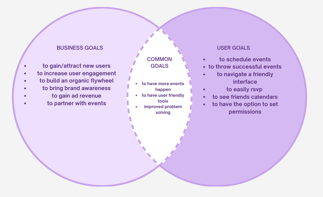
Before moving into the Develop stage I needed to first define the project’s business goals while keeping user needs at the center. Using a Venn diagram, I identified overlapping priorities:
Increase the frequency of events. Encourage users to organize and attend more gatherings.
Develop a user-friendly tool. Ensure the platform is intuitive and easy to navigate.
Improve event planning solutions. Address common scheduling and communication challenges.
Develop: The Concept
Through idea generation, I conceptualized a social calendar to simplify event planning. Key features included adjustable privacy settings and the ability to effortlessly send invites by viewing friends’ availability. This concept became Huddle Up, a platform where friends can seamlessly sync schedules and share invitations with ease.
Site Map
To align with user expectations, I conducted card sorting to understand preferences. Inspired by social media apps like Instagram, I designed a flat structure with a dashboard for easy navigation. The "Create Event" button was prioritized to directly address user needs.
User Flows
I mapped step-by-step user flows to visualize how tasks like syncing a calendar or adjusting access settings would work within the app.
Wireframes
low-fidelity wireframe:
I started with low-fidelity wireframes in Figma for convenience, enabling me to gather direct feedback from peers and mentors. This collaborative process helped me refine the structure and solidify the design direction.
mid-fidelity wireframe:
To further clarify the visual and functional aspects, I then created mid-fidelity wireframes, which provided a clearer sense of how the final design would take shape. These wireframes also served as a valuable tool for testing usability and identifying areas for improvement before moving into high-fidelity designs.
Branding
I set out to design a logo that symbolized hands and people huddling, representing my brand values of joy, trust, community, and connection. Initially, I used five symbols, but it ended up forming a star shape that didn’t work, so I opted for three symbols instead. The original font logo didn’t feel cohesive, so I switched fonts for a friendlier look. After feedback that the colors were too flat and resembled a hospital, I added a gradient with the secondary color to bring more depth.
Wireframes
high-fidelity wireframe:
I transformed the mid-fidelity wireframes into high-fidelity designs and connected the hotspots to build an interactive prototype. This makes it possible to click through and experience the different task flows.
Usability Test Plan
The next part of the process was to create a usability test plan. The test subjects were to complete 5 tasks and the success metrics were judged based off of:
Quantitative: Task completion time, error rate, and success rate.
Qualitative: User feedback, comments, and observed frustrations.
Results and Feedback
Zamir (Tech Professional): Struggled with the "Create Event" button placement and suggested moving it to the center navigation.
April (Proficient User): Found the app intuitive but suggested a more visually engaging layout.
Marius (Smooth Navigator): Requested progress indicators during onboarding to reduce impatience.
Erika (Ideal Candidate): Recommended improvements to visual hierarchy and typography.
Alan (Secondary Target): Found the calendar confusing and suggested analyzing other calendar apps for inspiration.
Final Iterations
Based on usability testing feedback, I implemented the following changes
Relocated the "Create Event" button for better visibility.
(It is now included in the navigation bar for accessibility)
Enhanced aesthetics with updated fonts, colors, and layouts.
4. Improved onboarding by adding progress indicators and limiting it to new users.
4. Created a consistent design for a seamless user experience.
5. Simplified calendar features for better usability.
Conclusion
Huddle Up reimagines social scheduling by combining intuitive design with powerful functionality. It bridges the gap between professional tools and personal event planning, enabling users to connect with their social circles effortlessly. By addressing key pain points in scheduling and communication, Huddle Up fosters meaningful connections and simplifies the process of spending time with loved ones.
What I Learned
Working on Huddle Up taught me valuable lessons about the design process and user-centered problem-solving:
The importance of research: Understanding the target audience’s pain points and preferences is crucial for creating a product that meets their needs.
Iterative design improves outcomes: Feedback from usability tests was instrumental in refining the design and enhancing the user experience.
Balancing simplicity with functionality: Prioritizing core features while keeping the interface intuitive was a key challenge.
What I Could Do Better Next Time
Narrow the focus: Conduct interviews with a more defined demographic to gather more precise and relevant insights.
Allocate more time for testing: Conduct additional usability tests to further refine the app and address edge cases.
Improve branding consistency: Spend more time aligning visual elements with the app’s overall tone and purpose.
Project Link:
https://www.figma.com/proto/qHdegstigrFyVaHJt0R74G/Final-iteration?node-id=88-1960&starting-point-node-id=4%3A1798&t=oeZec2J9clXXQVFT-1


